Yesterday, Tweetdeck released an update to its desktop AIR Twitter application and also released a free iPhone version of Tweetdeck. After playing around with the iPhone Tweetdeck, it’s giving Tweetie a serious run for my most used iPhone Twitter app. The new desktop release of Tweetdeck comes with a sync feature (as well as multiple accounts, column trends, recommendation column, reply all button, as well as a few other features) which will upload your configuration to a cloud, keeping your iPhone and desktop in unison.
That means all your columns from your home computer will also appear on your iPhone. The syncing is done in the background to reduce the processing strain.
Growl Notifications
Upon opening up Tweetdeck, you’re greeted with a few notifications in the top left of the screen, showing you the tally of latest tweets.
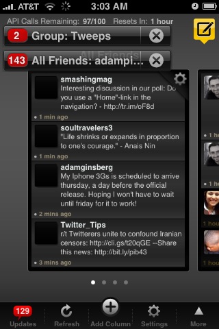
Welcome Screen for TweetDeck iPhone
You can access this tally via the updates menu at anytime in the bottom left corner.
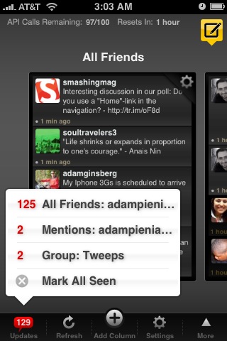
Updates menu in Tweetdeck
Columns
You can switch columns via the left and right arrows in the top left and bottom right corners (respectively).
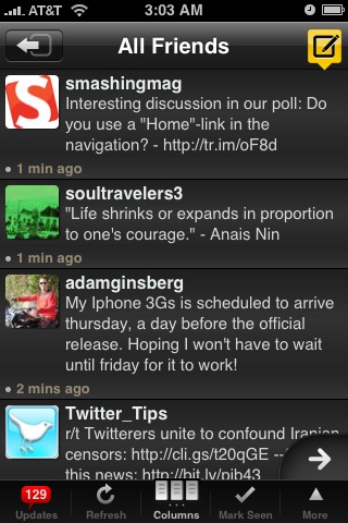
Switch columns from within a column.
Column view lets you flip through columns similar to flipping through windows in Safari.

Use column view to switch columns.
You can add a new column in the iPhone app and sync it to the cloud server to have the same column on your desktop. Create a user group, search, all friends, mentions, or direct messages column.
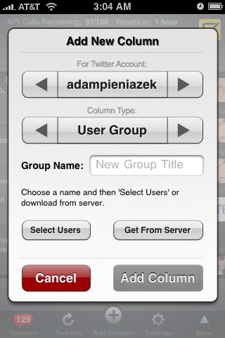
Add new columns and sync with the cloud
Settings
Both versions of Tweetdeck now come with full support for multiple accounts. It’s a very welcome feature and is implemented via adding more columns. Tweetdeck now supports unlimited columns, allowing you to add tons of accounts and scroll or flick through them.
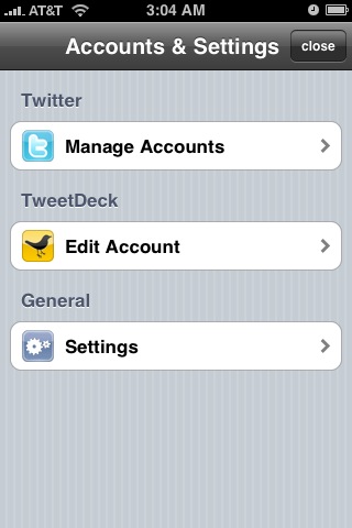
Multiple accounts!
There’s a few cool general settings in the iPhone app. Settings include auto-correct, growl, choice of twitpic or yfrog, show real names, and option to shake to refresh the screen.
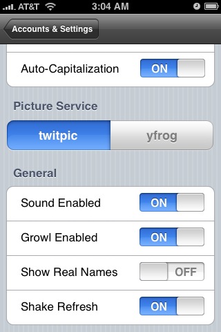
Tweetdeck general settings
Quick Follow
At the bottom of the Tweetdeck screen, there’s a row of icons. They include updates, refresh, add column, settings, and more. The more button pops up a screen with two options, sync columns and quick follow. Clicking sync will check the cloud for updates and allow you to then sync your columns.
Quick follow pops up a screen allowing you to type in someone’s Twitter handle and follow them with a quick click.
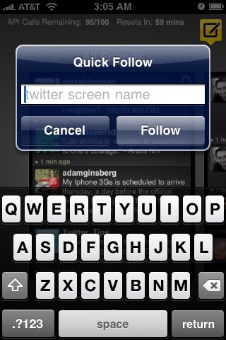
Quick Follow (handy for tweetups)
Tweeting and Bios
Creating a new tweet takes you to a relatively standard window allowing you to type up your tweet. There’s options to shorten a link, upload a photo, and update your profile location. You can also send out a map link to your current location. Cool tool for sending out directions.
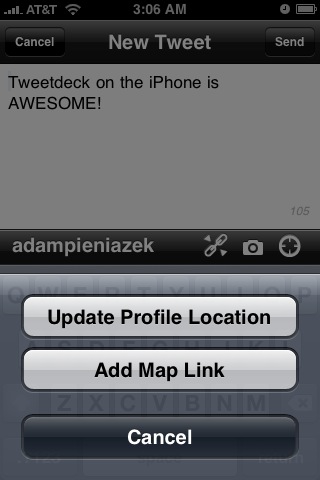
Update bio location and add a map link (works on non-GPS too)
You can also look at individual tweets, which gives you options to reply, retweet, send a DM, favorite it or email the tweet.

The individual tweet window
From the individual tweet screen, you can also check out the user’s bio. Mostly standard stuff, but if you scroll to the bottom there’s an option to block/unblock the user and add them to a group.
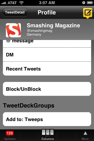
The bio page, add to groups, follow, @, DM, or block
So far, I’m really digging the new Tweetdeck application for the iPhone. Up until today, I’ve been a staunch user of Tweetie and didn’t even bother looking for anything else. Tweetdeck has crashed a few times on my iPhone, but that’s to be expected for a first release (which is also free).
It might be due to my original (non 3G) iPhone or a few bugs they need to work out. But it’s happened rarely enough to not be a huge detriment so far. Aside from the couple of crashes, I love everything about this app. It’s a really intuitive interface for the iPhone and the columns translate really well to the smaller touch screen.
Read more about the new Tweetdeck desktop and iPhone applications on their blog. If you’re all set and ready to try out the update and new app, install Tweetdeck for the iPhone or Tweetdeck for the desktop.
Have given the new Tweetdecks a try? What do you think?
I think they have over complicated a simple process. I think it is clumsy looking. Twittelator Pro is far more capable.
The good thing about TweetDeck it is free, and knowing Ian (the creator) he will improve on the product.
Hmm, I see it the complete opposite way. To me, Tweetdeck is a simplification of the process. Instead of having to switch between multiple accounts/windows, you just flick left to right and vice versa. I can see how if someone set up a bunch of columns it would make it tough to navigate, but for my 3 twitter accounts with a few columns each Tweetdeck is simpler to bounce back and forth between windows.
That’s what I love about the Twitter community. There’s developers like Ian making one style of app and other developers making completely different styles. Having options is nice!
This is a great review of Tweetdeck, Adam! Thanks for the rundown – now I have to run and download it 🙂
No problem Sarah, hope you enjoy it. It’s becoming my primary twitter iPhone app fast.
What a great app! I enjoyed how simply delivers powerful capabilities. Thanks Adam for the review.
On point Dan. Everything seems to be accessible with couple flicks or touches. Finding it very simple to use and fast.
fresh information, it make me in hurry to try it
tweetdeck rocks….thumbs up…
This makes me want to get TweetDeck. 😀
any idea why they did not include trends?
My guess would be they either focused on the other aspects first, or it was a data/bandwidth/processing concern.
How do you navigate between accounts on the iPhone app?
You have to add new columns. When you add new columns (replies, DMs etc), they’ll be for your other accounts. Then you can flick left to right and vice versa to navigate through the multiple accounts.
See their info page for multiple accounts.
wow…this is very useful informations…thnz
Nice review. I went and tried it out, and I’ve had the crashes, too. I’ll keep checking in on updates for it, using Twitterfon as my main app in the meantime, but I could see myself switching when it gets more stable, since it does much more than Twitterfon.
Yup, it’s especially unstable on the 2G network. I get lots of unable to connect because of a weak connection errors, but when it does work it rocks so much that I still have it as my go-to app, with Tweetie as a fallback. Nice to have options. 🙂
Hoping when I pick up the 3GS and a new update comes out many of these issues go away.
Thanks to @mjcarter for telling me about this blog post. I have been wanting this app for a long time now.
Love the screen shots!
-Christina Hills
very very nice i have been waiting for this app so i can use to get on my twitter account from my brand new iphone =)
[…] As far as the iPhone goes, I still plan on using TweetDeck since I really like the interface. For an in-depth review, check out TweetDeck for the iPhone. […]
I wish that I could get an iPhone. Man, it sucks to be in an area that doesn’t allow the technology!
Never heard of it before, just installed it and twittering away! Thanks!
Now I MUST buy an iPhone!
Heartland Energy Colorado
Great post, now i will buy one iPhone 😀
Thanks
Still don’t have the Iphone… just isnt my thing. I hate Twittering as well? Maybe I was born in the wrong century!