Over the weekend I unveiled a new design here. The old one was around for a little while (during my switch to Thesis theme I basically kept my previous design) and I really wanted to go in a different direction.
What Changed?
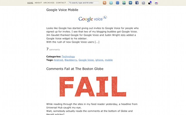
The new design features a fixed header that stays at the top wherever you go, allowing you to quickly search through the site, access the archives, send me an e-mail, subscribe to the blog feed, or connect with me on one of my favorite social media sites. My intent was to move from a huge header that simply looked good to one that took up little real estate but was useful. To that extent I think the new slim, fixed header is a big success. But let me know how you feel, I’m always open to feedback! 🙂
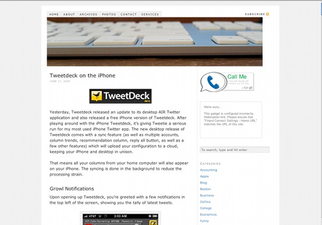
Some of you may be disappointed that I got rid of the old header with the great Apple keyboard shot, but it was time for a change. Sorry Dave I’m afraid I can’t do that.
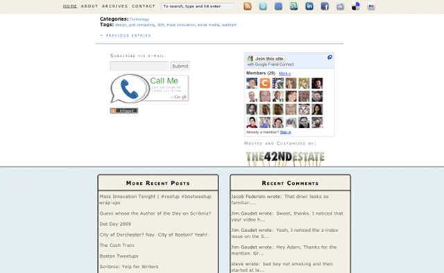
Other changes were dropping the sidebar widgets to the bottom of the page, allowing me to give the main content a much wider space. Doing so lets me embed full size YouTube videos and wide images into posts. As you can tell, I really went for usability and functionality here rather than looks. The look itself is really simple and clean and draws the focus back onto the content.
On a sidenote, you’d think the new wider look would break on an 800 x 600 resolution, but that’s not quite the case. By dropping the sidebar below the content the design scales gracefully to a low resolution.
I’m still working on re-adding some of the widgets I had before (most notably the Scribnia and Friendfeed widgets) but otherwise it’s all done!
Before & After
Here’s a snap of the before look (note, it’s not an exact replica as I deleted the old look, this one is from an older local copy I had but it’s basically the same):
Now let’s take a look at how this section looks in the new design:
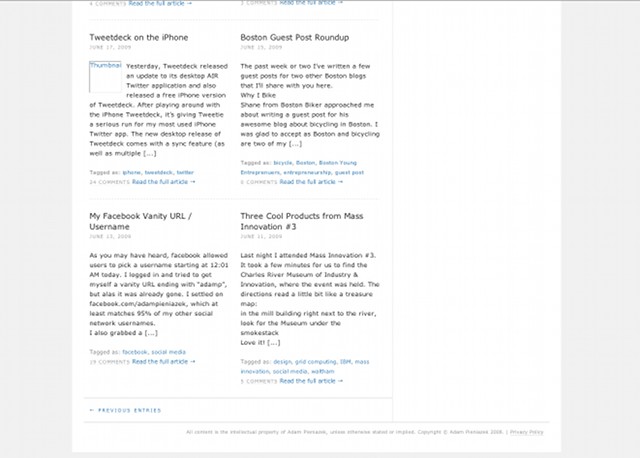
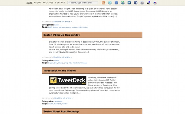
Another section I wanted to tweak up was the Thesis teasers section. I felt they were a bit small so I widened them out and made each teaser fall on its own line. Personally, it makes it easier to scan through the teasers and archives and allows for a bigger thumbnail image.
Here’s how the teasers used to look:
Looks OK, but in the move to the wider main content column, they looked a bit scrunched up and out of place. In the new design each teaser falls on its own line:
Another section I felt needed a good deal of revamping was the comments and footer. Here’s a look at the old comments and footer section:
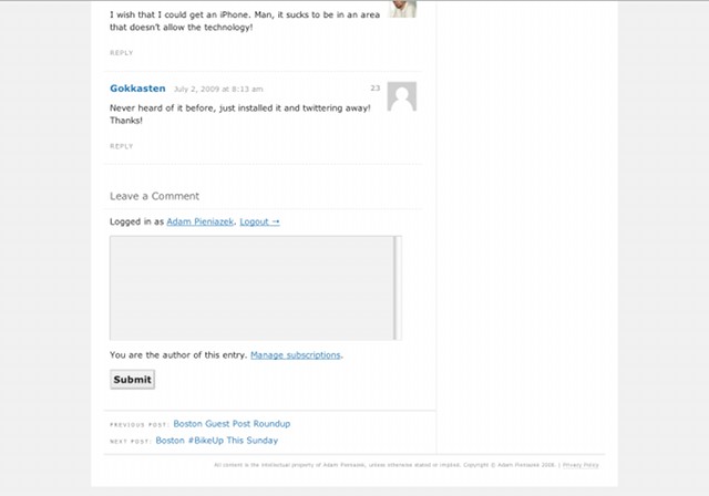
Quite bland, eh? Let’s take a look at the new comments and footers, which for those of you using new versions of Safari or Firefox feature lots of easy to look at rounded corners.
And here’s the comments:
That’s about the bulk of the changes. There’s a few more tweaks and touchups here and there but the majority of the look’s covered above. If you find anything out of place or have any suggestions or questions on how I did something, feel free to ask. Hope you all enjoy the new design!
Thanks to eelke dekker for the HTML vs. CSS lego figures.

Everything is great. I really like the idea of not having anything on the sides. If I didn’t just re-do my site, I think I would go with something like this.
I am sure we will see some sort of clickable pop out on the sides.
The only thing I would do is add some hover effects to the social buttons in the social bar and the big ones above the comments. Like 50% opacity or something, that’s pretty norm
Thanks Jim. Yeah, I’ve been considering adding a side pop out. For now I’ll leave it as is until I decide on what I’d want that pop out to do.
I originally had a hover effect that made the icons bounce but dropped it as it was a bit distracting and wasn’t super smooth. But you’re absolutely right, it needs to be a bit more dynamic. I’ll play around with it a bit.
That’s agreat canging bro. U’ve good works, It looks so nice.
Thanks Ahmad. Glad you like it! 🙂
I’m a big fan of the clean and simple look. It’s so much easier on the eyes compared to some of the blogs I come across that have every widget known to man running on their sidebars.
Awesome design!
Thanks Justin. I too have seen the infinite widget designs and they were a reason for going in the other direction. Glad you enjoy it. 🙂
Lol, now i’m always gonna wonder what you were going to do with that keyboard shot. Thanks for the shout out. I just redesigned my blog for a lot of the same reasons. Check it out and lemme know what you think. I really needed to be able to put larger images in my blog, so that’s a lot of the reason for the redesign. I liked it so much that now I’m redesigning my whole website to be a little more like my blog. I think my website is currently just a little too dark, so I’m having to go through and change a lot of stuff. Anyways I like the new look. The header bar is a good idea. You should make your recent commentors name links to their site as one suggestion. And I think it’s hilarious that when you describe the new content section you use an image where the only legible text is a big red “FAIL”… HILARIOUS. (prolly not intentional, but still hilarious.)
Got to keep some suspense going here Dave. 😉
I really, really like the new blog design. I’d agree with you that you should port your new blog design to the rest of the site. The lighter colors really help bring out the colors of the images and in general is just much easier on the eyes. Good job Dave!
I’ll see if I can make the name in the footer link to each bloggers’ site. That’s a great idea!
LOL, the fail image was definitely not intentional, just a capture of the latest posts. I just had a good laugh myself.
Well I finally got my site redesign up. And it’s a good thing, too because i was just starting to reach my limit on motivation for actually getting it done. I’m sure that now I’ve redesigned my whole site google will f**k me for a little while, but I’m hopefull that all the things that I did for SEO will help me to start kicking booty on the keywords that I really want to be found for. Tell me what you think of the footer on the main site, It has the last 3 blog posts that I wrote. I think that should help all my pages look fresh and new everytime that google comes a crawlin. It’s a good thing I know c# otherwise it never would have happened. Anyways lemme know what you think.
Ooooh, pretty new design Dave!
For the footer, anything you can do to pump in fresh content and internal link helps.
Have you seen SEOmoz’s Search Engine Ranking Factors report?
It’s quite helpful at figuring out which parts of SEO to really focus on. I reference it all the time. As for the redesign affecting SEO, if anything I’ve seen Google like new designs. Have seen a little bit of a spike here with the new design, though that might be because it loads quicker and focuses on content (or just random coincidence).
Thank for that link. That’s really helpful. I had never seen that before. Here’s a link for you, it’s called website grader, and That’s what i’ve been referencing along with a ton of other stuff.
http://www.websitegrader.com/
I think after the redesign I went from a 47 to an 89 or something.
Website Grader is cool, the company that runs it, HubSpot, is based here so they get extra points for being in Boston.
Nice jump up in Grader buddy!
I just wouldn’t follow all of their tips but rather us it as a guide. For instance they tell me I have too many photos, but meh, I like having images on my site and they’re small enough.
I’m at a 99.4 right now. 🙂
99.4 … dizzamn. Nice work man I think the largest jump is the fact that it found my blog and added that to the score, as opposed to what it was doing before where it wasn’t capable of finding my blog. On another random note, there wasn’t a reply button at the bottom of your comment, so I had to reply to this one? Maybe a bug, or is there a limit to the number of replies in your new theme.
I think the new design is really clean. Very nice – functional and stylish.
Thanks Shareef. Glad you like it! 🙂
I love your new design and the header that stays at the top of the page. I don’t think I never seen that before!
Well, I’m certainly not the first to use a fixed header Carla but I’m glad I was able to introduce you to the concept. 🙂
I think as long as it’s kept small and functional it can be a very positive aspect of a design. I’ve seen a few that are huge and filled with bloat that make reading the page really tough though so moderation is key.
Thanks for the compliment on the new look!
That’s agreat canging bro. U’ve good works, It looks so nice.
Nice work 🙂
You are the best
Nice design! So enough space.. like it!
Good design.. never seen such headers for blogs. It has a stylish look especially the comments box which saves space. Keep up the ood work..